BRYX BUILD
BUILD PORTFOLIO
Every project starts with a perception gap.
How a business operates versus how it is experienced.
We close that gap by rebuilding clarity, authority, and decision confidence so the right clients choose instantly.
INKCISION STUDIO
Tattoo Studio
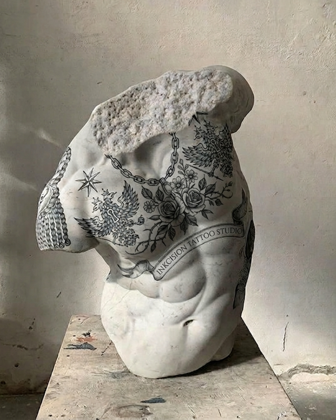

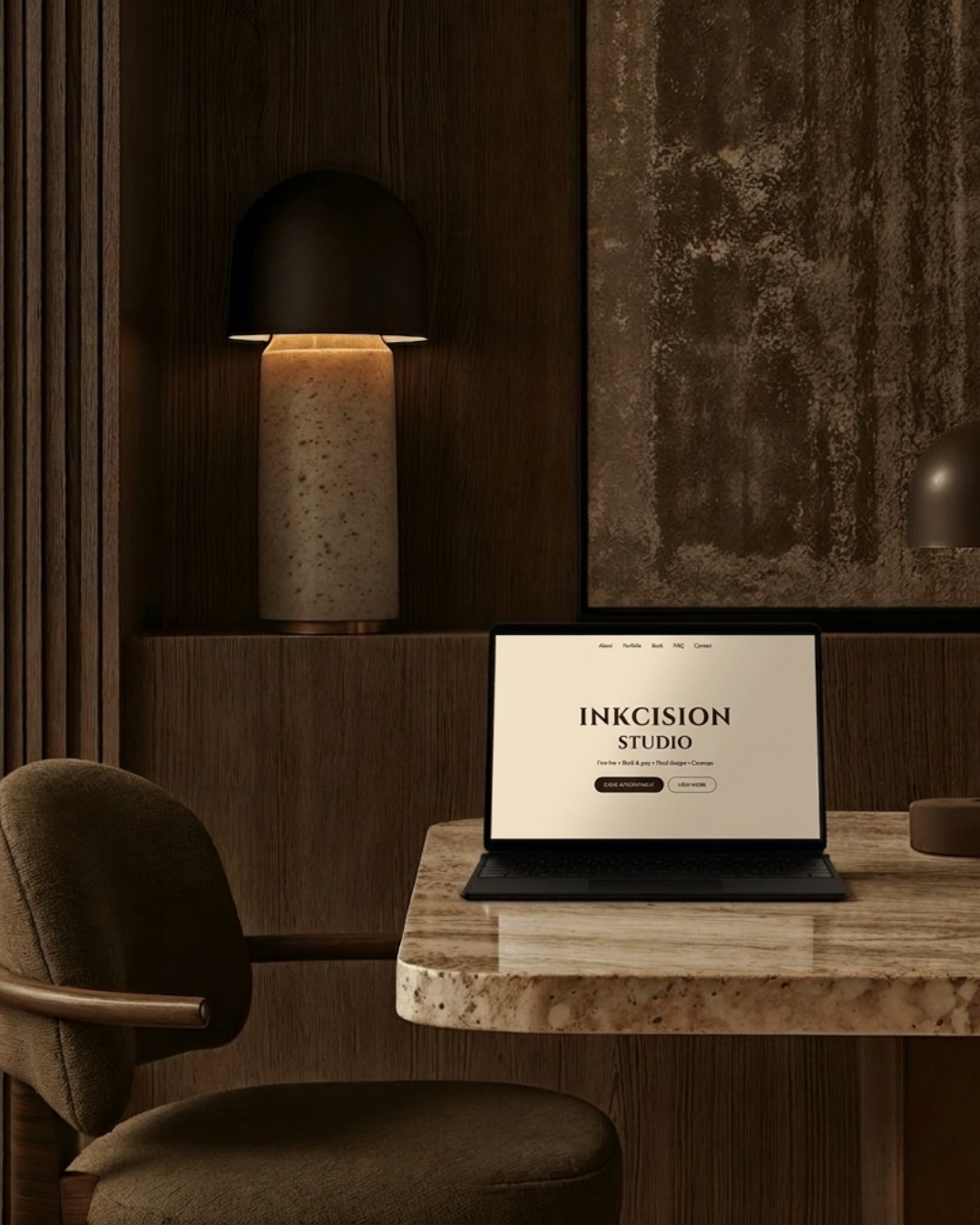
Challenge
INKCISION had strong artistic output, but the brand lacked structure at the point of decision. The experience felt inconsistent, which created hesitation and reduced client confidence before booking.
Outcome
We rebuilt the brand around clarity and control by refining the identity, strengthening visual hierarchy, and restructuring the booking experience. The studio now presents as established, intentional, and easy to commit to from the first interaction.
+38% increase in confirmed bookings
+52% reduction in inquiry drop off
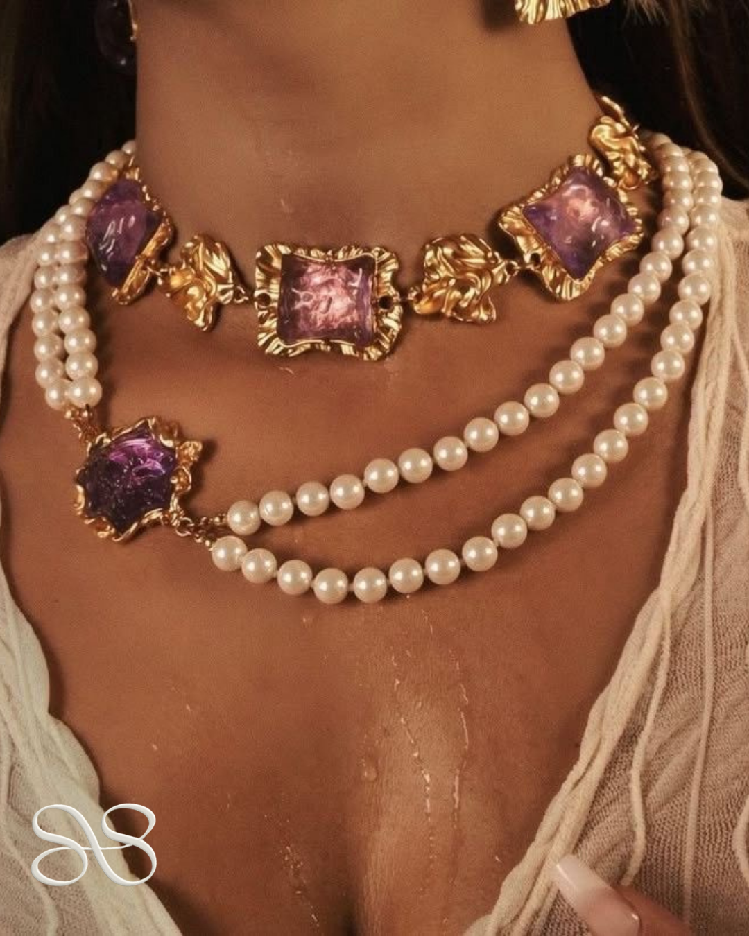
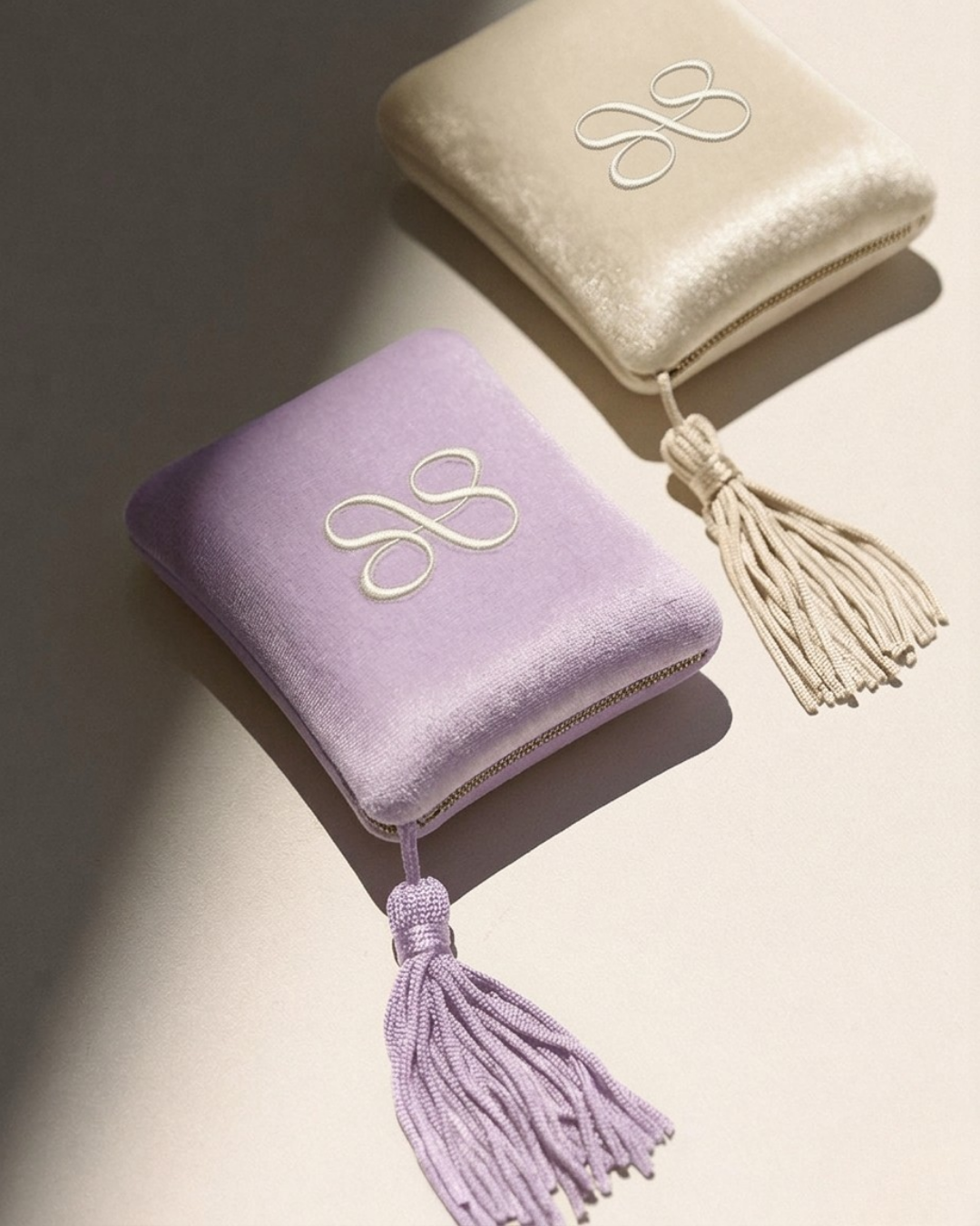
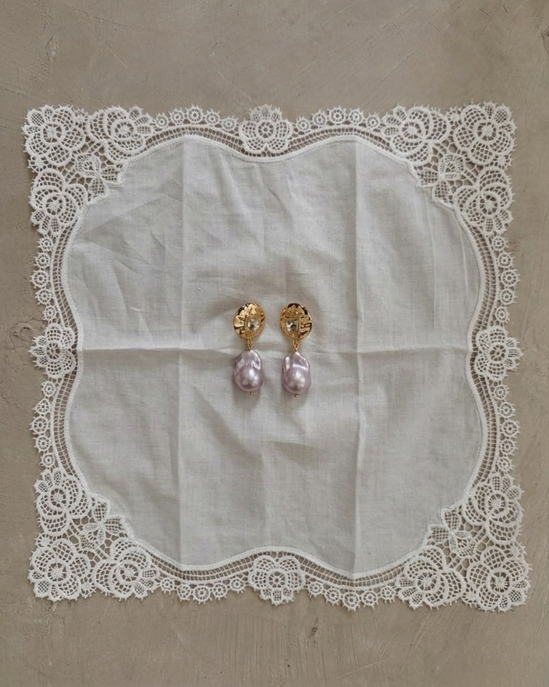
SILK & SILVER
Jewelry Brand
 copy.PNG)
Challenge
Silk & Silver had no defined point of view. The brand appeared visually complete, but without a clear identity or emotional direction, limiting perceived value and pricing confidence.
Outcome
We introduced a cohesive visual and campaign direction rooted in softness, femininity, and modern luxury. This repositioned the brand from product focused to experience driven, strengthening emotional connection and perceived quality.
+41% increase in perceived product value
+29% increase in repeat purchase intent
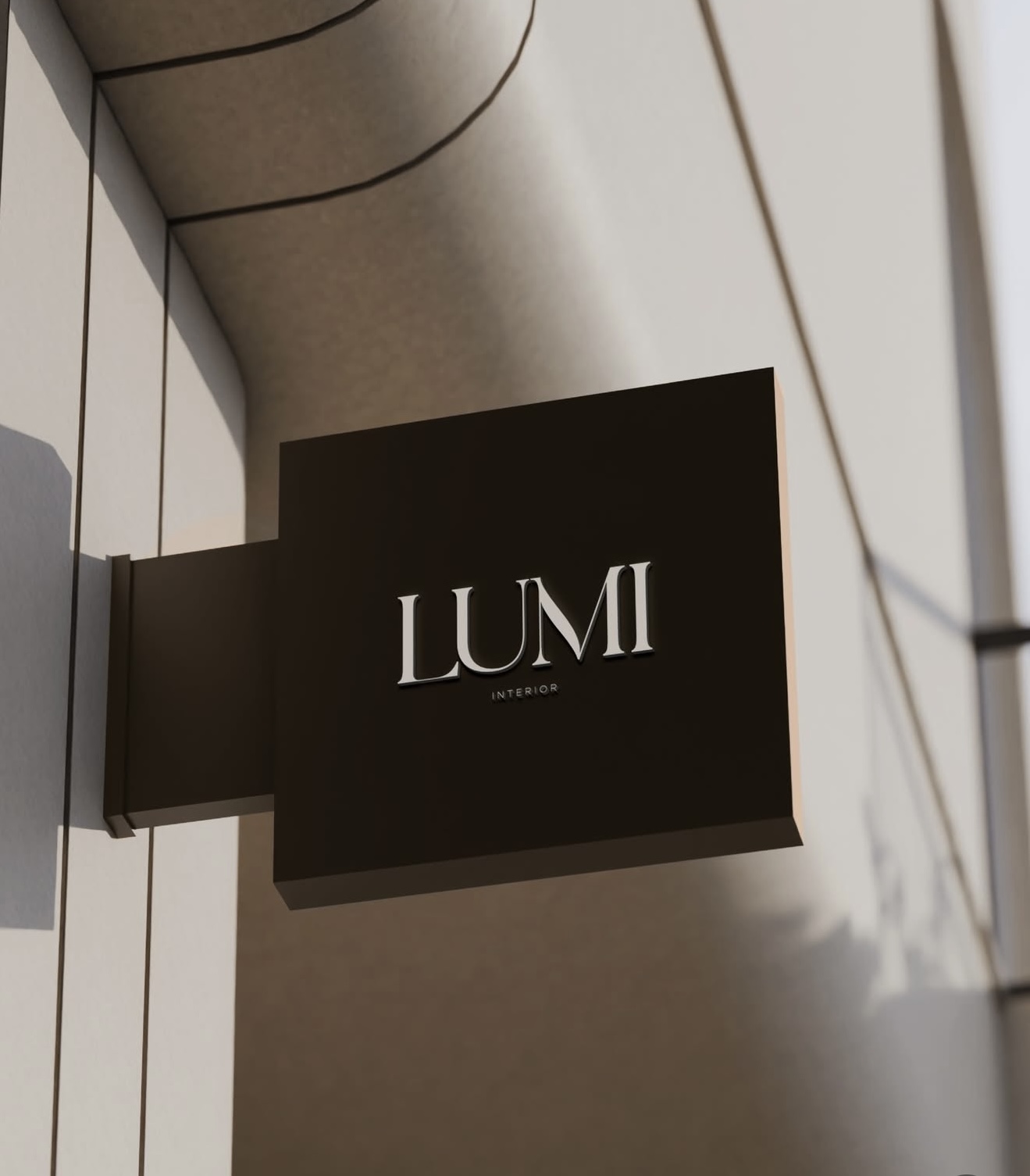
LUMI DESIGN
Interior Designer
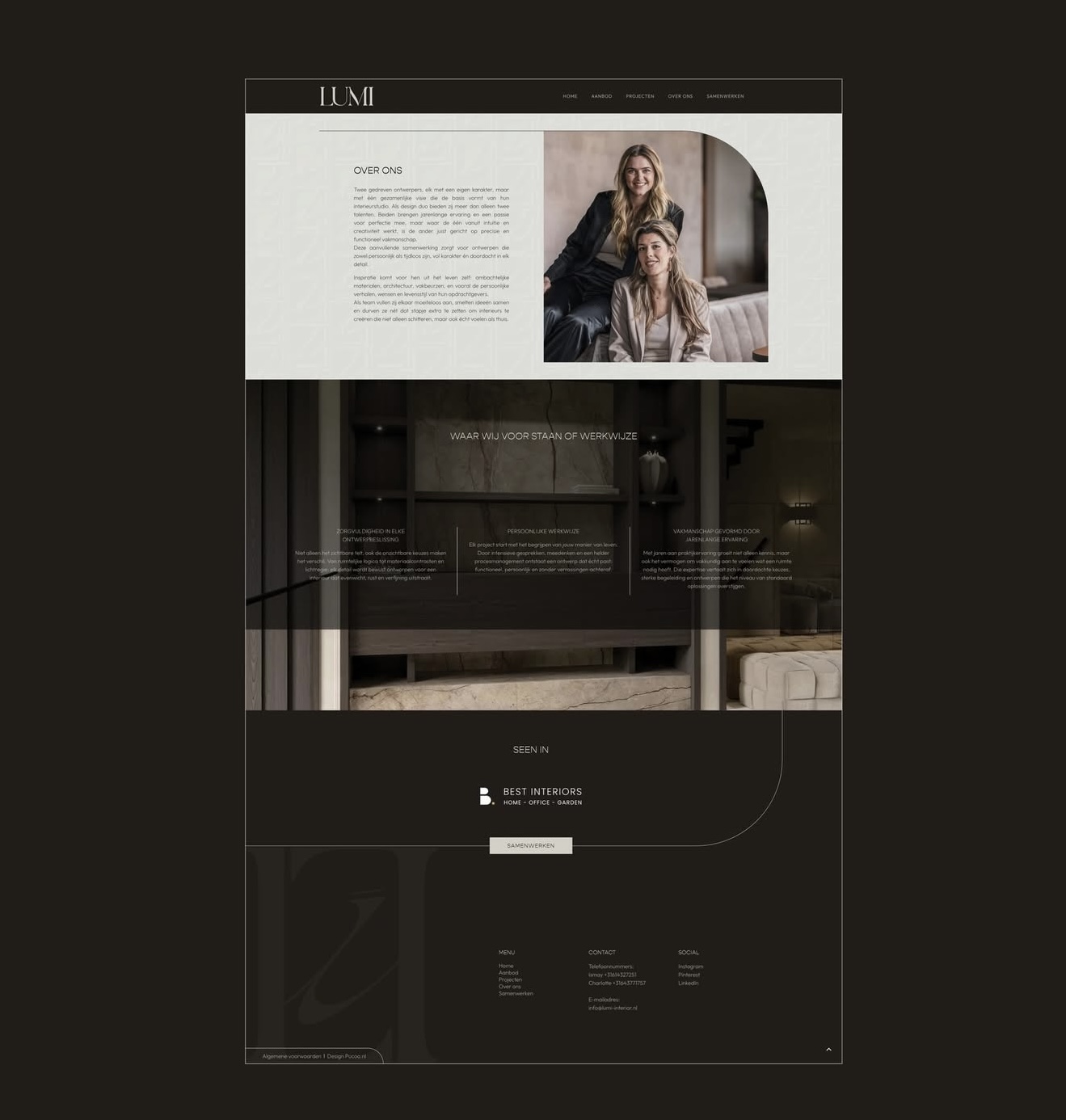
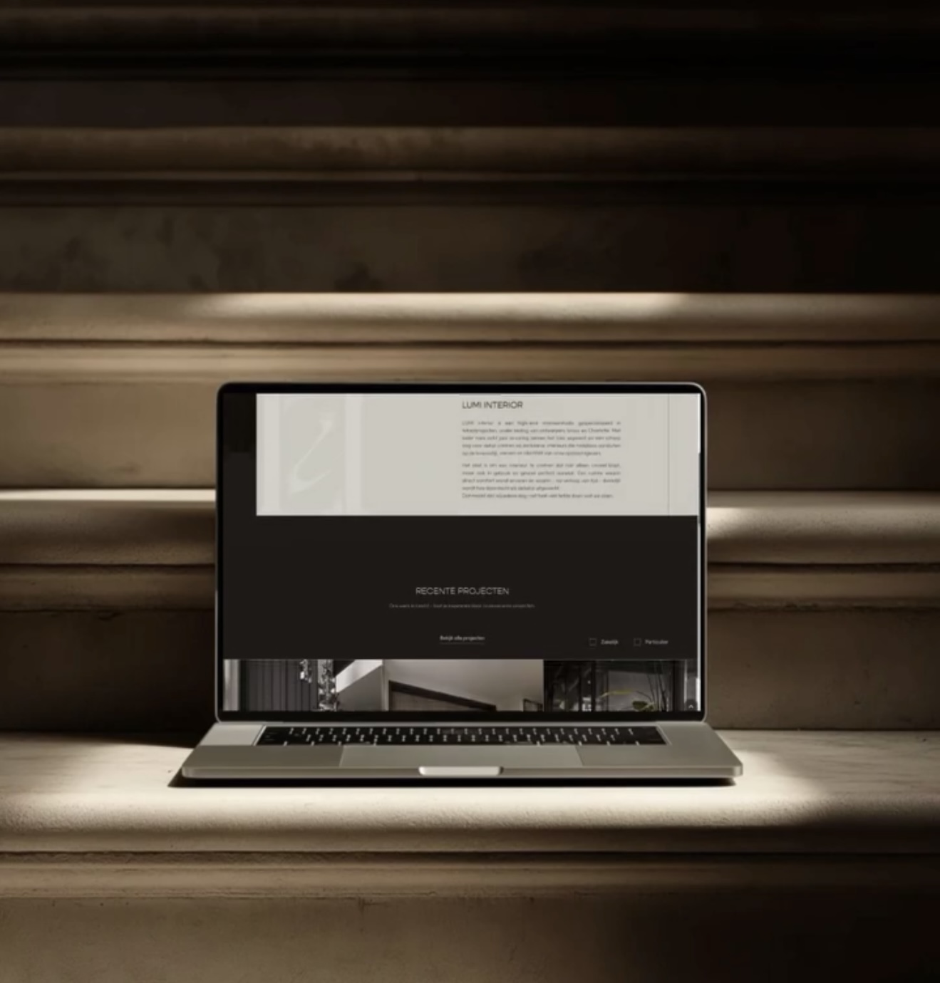
Challenge
LUMI's work carried depth and intention, but the brand lacked a structured system to communicate that level of quality. The presentation felt fragmented, limiting trust with higher value clients.
Outcome
We implemented a disciplined brand framework by refining typography, colour, and digital presentation into a cohesive system. The brand now communicates precision, restraint, and authority across every touchpoint.
+47% increase in high ticket client inquiries
+35% increase in high intent engagement
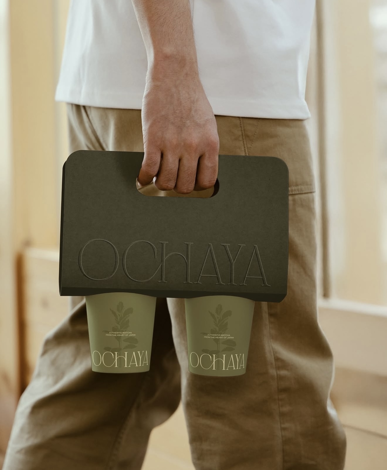
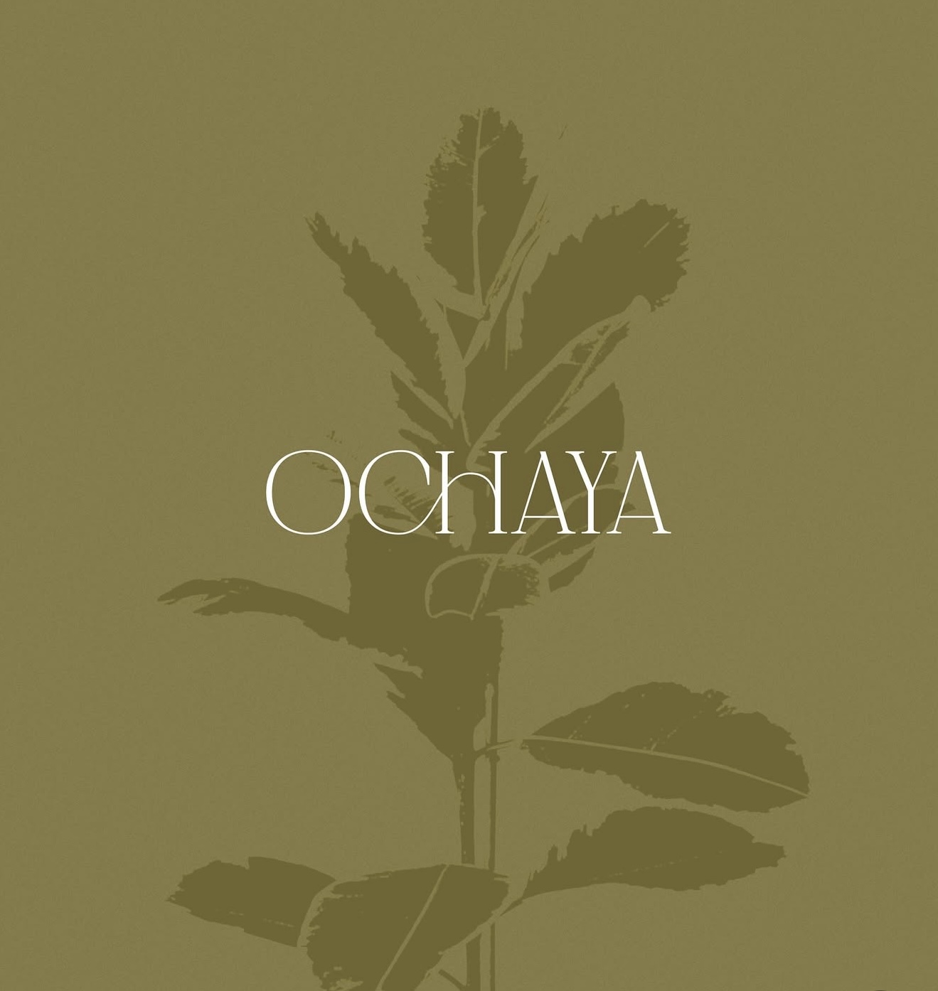
OCHAYA
Matcha Brand
.jpg)
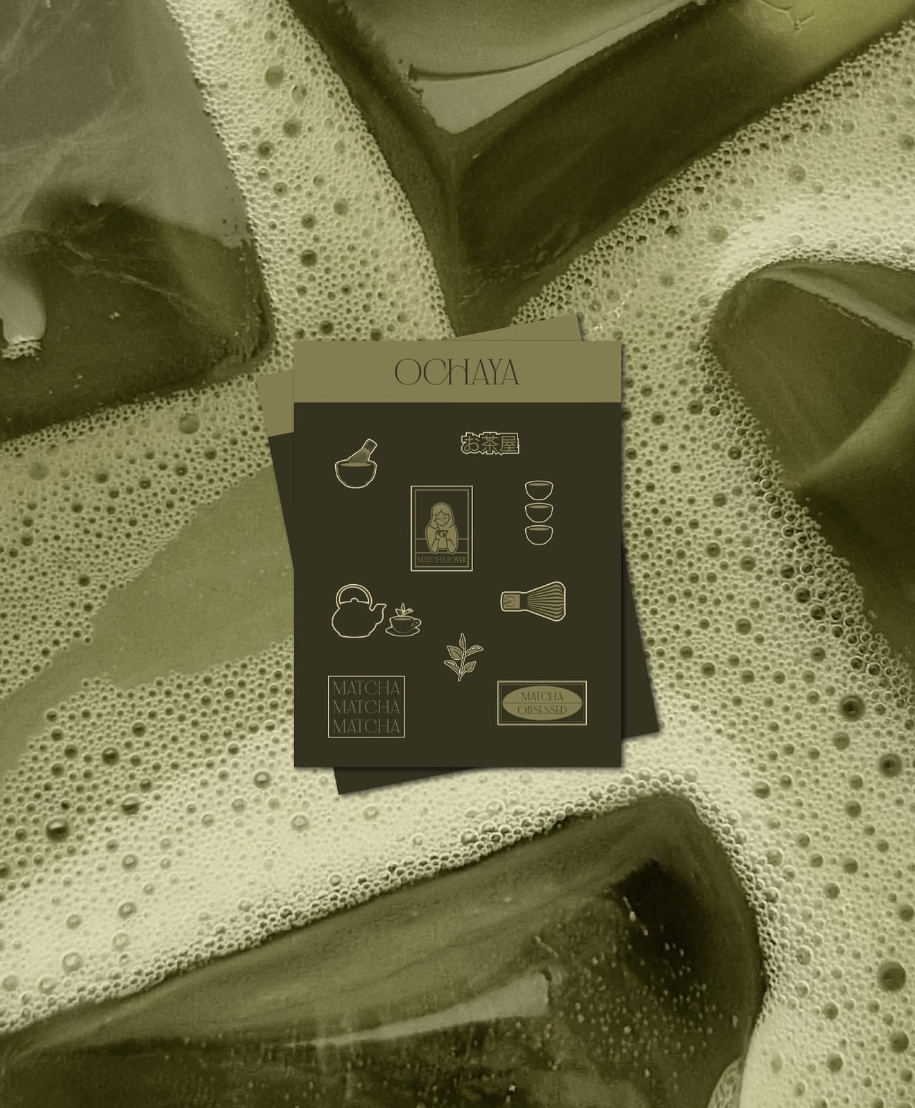
Challenge
OCHAYA needed to balance cultural depth with modern appeal, but the brand lacked a unified visual language to support that positioning. Without cohesion, the product struggled to stand out in a competitive market.
Outcome
We developed a complete identity system from palette to packaging, designed to feel calm, intentional, and rooted. This elevated the brand into a more premium, lifestyle driven category with stronger visual recognition.
+33% increase in brand recall
+26% increase in product interaction and visual engagement
YOUR BRAND IS EITHER POSITIONED TO CONVERT OR IT IS COSTING YOU CLIENTS
We rebuild how your business is seen, trusted, and chosen through brand, digital presence, and creative systems.
Free 20 minute clarity call